
Guide To The Psychology of Color in Luxury Packaging
Colors are the visual representation of how customers see your brand. Simply put, the psychology of color in packaging plays a key role in shaping how customers view a product. It influences their purchase decisions and helps develop brand loyalty.


.jpg)
In this blog, we will answer the following vital questions regarding color psychology in branding.
- What is the role of color in customer buying behavior?
- What colors symbolize luxury in packaging?
- How to use color psychology for luxury branding?
We will also look at the luxury packaging color trends and how you can use them to improve product appeal and boost sales. So, let’s start by looking at what color psychology is and how it works.
What Is the Psychology of Color in Luxury Packaging and How Does It Work?
Colors influence us in many ways. A color can affect your mood and feelings and make you see things in a different light. These effects are commonly known as the psychology of color. It talks about how colors make us feel and associate certain qualities with objects.
The psychology of color in packaging is especially important for brands in terms of marketing. The right use of color psychology can help a brand market its products well and drive people to make a purchase. So, let’s take a closer look at the significance of color psychology and understand how it affects packaging design.
Influence of Color Psychology on Packaging Design
When it comes to designing luxury packaging, brands must consider two important things. First, the emotional impact of packaging colors on consumer behavior, and second, how it influence their decisions. That said, let’s look at how color influences customer perception and guide their purchase decisions.
The Impact of Colors on Consumer Behavior
Several studies show that color is the first thing people notice in a product. Moreover, around 90% of customers purchase products based solely on color. Since a majority of customers buy products based on colors and packaging design, it makes the color selection for premium packaging even more important. For a better understanding of the role packaging plays in customer decisions, check out our blog on Custom Packaging vs. Stock Packaging.
But what does this mean for a brand? Simply put, leveraging color theory effectively in product packaging can evoke the right emotions, helping to establish a strong connection with customers.
The Role of Color In Branding and Packaging Design
The importance of color in luxury packaging has a much deeper impact on both customers and businesses. The psychology of color in packaging has the power to communicate brand values to consumers. And it can influence them in more ways than one. For instance, global luxury brands like Chanel often use white and black colored packaging for minimalistic designs. Why? Because both these colors convey luxury, sophistication, and elegance. To learn more about the features of luxury packaging designs, read our detailed blog on Features for Luxury Candle Packaging Design.
That brings us to a very important question. What do different colors mean for brands, and what colors symbolize luxury in packaging? Let’s find out!
The Psychology of Color In Luxury Packaging - The Meaning Behind Colors
Color theory in product packaging defines the visual appeal of a product. And it all boils down to the meaning behind each color. Since different colors have different meanings, they evoke different feelings.
For example, cool shades like hues of blue and green represent a sense of calm, tranquility, and health. That is why they are perfect for healthcare and beauty products. On the other hand, warmer tones like red, yellow, and orange represent feelings of excitement and hunger. That makes them ideal for food products.
Let’s look at these colors in detail and see what colors symbolize luxury in packaging.
| Color | Meaning and Usage |
|---|---|
| Black | Symbolizes sophistication, luxury, and power. Used for jewelry, watches, cosmetics, and electronics. |
| White | Represents purity, simplicity, and transparency. Popular for cosmetics, skincare, and hygiene products. |
| Red | Evokes excitement and passion. Ideal for food, beverages, and seasonal or limited-edition products. |
| Blue | Conveys serenity, trust, and reliability. Commonly used by healthcare, technology, and hygiene brands. |
| Green | Reflects nature, health, and sustainability. Perfect for organic, eco-friendly, and wellness products. |
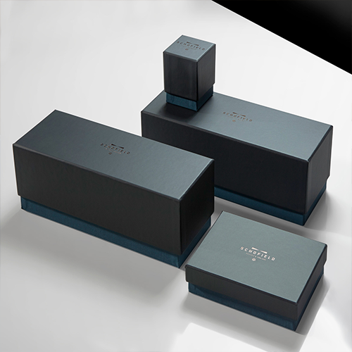
Black - A Symbol of Luxury and Elegance
When it comes to packaging design, the color black is seen as a symbol of sophistication, luxury, and power. That is why black is one of the colors that define luxury brands. It communicates a sense of exclusivity and status to customers. This color is mostly used to pack expensive items like watches, jewelry, bags, clothing, cosmetics, and even electronics. Black packaging boxes, in combination with metallic finishes for luxury packaging, are the go-to option for minimalistic yet powerful designs.
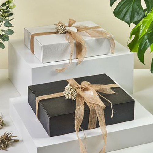
White - An Image of Purity and Simplicity
White is also one of the most popular color choices for high-end packaging. It portrays an image of purity, simplicity, and transparency. That is why brands use this color to establish a deeper bond with customers. It is commonly used to package cosmetics, skincare products, pharmaceuticals, and even household items that promote hygiene and cleanliness. Just like black, white also acts like a blank canvas and works best for minimalistic designs.
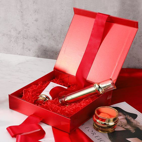
Red - A Sense of Excitement and Passion
Red is a color that creates a sense of excitement and passion in people. It is a popular choice for bold color contrasts in luxury packaging. Red is typically used for products like food and beverages, especially in combination with orange, yellow, black, and white. It also indicates urgency, so brands often use it for limited edition products, seasonal items, holiday packaging, and so on. For example, Coca-Cola packages its beverage in red to convey high energy and elicit a positive emotional response from customers.
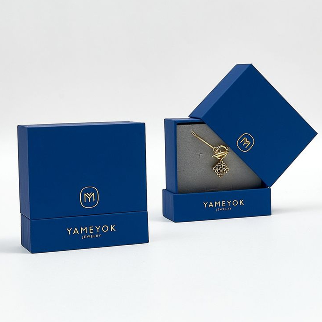
Blue - A Wave of Serenity, Trust and Reliability
Blue is seen as the shade of serenity, peace, and trust. It is one of the neutral tones for modern premium branding. That is why healthcare and technology brands use it to market their products. Pastel shades in high-end packaging design, such as light blue or powder blue, indicate reliability. Therefore, these lighter tones are mostly used in skincare, personal hygiene, and jewelary products. Moreover, blue brings out feelings of comfort and safety. That makes it ideal for brands that want to establish a professional and trustworthy image.
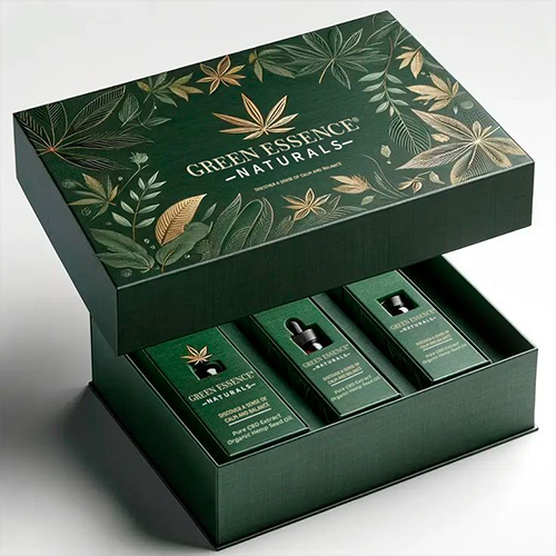
Green - A Breeze of Nature and Health
The psychology of color in packaging dictates that green color is usually attributed to nature and health. People associate it with wellness and sustainability. That is why it is a popular packaging choice for brands that market organic foods, health supplements, and other eco-friendly products. It helps brands strengthen the image of nature and reliability in the minds of customers. Moreover, businesses that package products in packaging made of sustainable materials also use green to attract customer attention.
Knowing the meaning of a color is one thing, and successfully using it to package products is another. So, how can you use the psychology of color to choose the right colors for your brand’s packaging? Let’s find out!


How To Choose The Right Color Combination For Your Packaging Designs?
Understanding the psychology of color in packaging can make a huge difference for a brand. It can help you choose the right colors and create packaging that will boost sales. Here are five key things every business must consider while choosing colors for luxury packaging design.
Think About The Customers
The very first thing on the list is customer preference. Colors represent different feelings for different age groups. Therefore, you need to conduct market research and find out what people want in the product you are offering. If you want to market your product to a wider customer base, consider going with a universally appealing color, such as blue, black, white, or gray. On the other hand, with a specific target market, like teens or tweens, bright colors like hot pink, red, or purple would be a better choice.
Look Into Cultural Preferences
The psychology of color dictates that colors also have cultural significance. That is why it is important for brands to consider the cultural implications before packaging or marketing a product. For instance, in China, the red color is seen as a symbol of good luck. However, in the US, it is mostly associated with holidays like Christmas, New Year, and 4th of July. So, package your products according to the culture you are marketing them in and you will succeed.
Represent Your Product According To Brand Values
Pack your product so it showcases the unique identity of your brand. There are a lot of ways you can make this happen. Let’s say you are a luxury brand in the process of designing packaging for a high-end product. Considering matte vs. glossy color options for luxury boxes is a crucial point that can make or break a product’s value. Similarly, if you are selling eco-friendly products, the psychology of color indicates that choosing earthy green tones is the best way to go.
Stay In Tune With The Latest Color Trends
Staying on top of color trends is the perfect way to get ahead of the competition. It shows customers that you are a professional and know what you are doing. So, do your research and find out the hot color trends to stay relevant.
However, it is equally important to understand how these color trends align with your brand’s identity. For example, let’s say pastel tone colors are in trend globally. But you are selling products that target the masculine demographic. Then, choosing pastel tones of pink or purple may not be appropriate.
Stand Out From The Crowd With Luxury Finishes
The psychology of colors proves that colors are a powerful marketing and branding tool. It can help differentiate your brand’s products on shelves and attract customer attention. There are several examples of luxury brands like Apple, Coca-Cola, and Chanel that are typically identified by specific colors. For Apple, it is white; for Coca-Cola, it is red; and for Chanel, it is black. Explore elegant color choices for premium packaging by WCB if you want a better chance of success.
Wrapping Up
To sum it up, the psychology of color in packaging plays a critical role in several ways. It affects customer’s perception of your products as well as the brand image. Moreover, it influences their purchase decisions, which impacts the business in more ways than one.
Simply put, you can improve your sales by mastering the art of choosing the right colors to package products. Understand what each color means and what it represents. Do thorough research on your customers and find out the latest color trends. All of these thingswill help you stand out from the competition and improve sales.
On the other hand, partnering with the right packaging company like WCB can reduce half of your stress. As a professional packaging manufacturer, we are always ahead of the packaging trends and can give expert advice where needed. Still have questions? Read our blog on why luxury packaging matters for premium brands.
FAQs
What is the color theory of luxury?
There are some colors that are usually seen as a symbol of luxury more than others. Colors like black, white, gold, silver, and purple are the perfect examples of this case. These colors convey a sense of exclusivity, royalty, refinement, and superior status.
What color is used to market luxury products?
Black is the most popular color used to market luxury products. The psychology of colors in packaging suggests that this color is a symbol of power, elegance, and sophistication. That is why it is used by global luxury brands like Chanel and Zara.
How do brands use color psychology?
The psychology of color in packaging and marketing shows how colors influence the purchase decisions of customers. It studies how colors influence consumer behavior and triggers emotions. Brands strategically use color psychology to evoke specific emotions in customers that lead to brand perception.
What are the most attractive colors for packaging?
It all depends on the type of product you are packaging and what is your target audience. If you want the safest color, try tones of blue. It is gender-neutral and loved by customers of all age groups. Other attractive colors include black, white, and gray. However, if you want to convey excitement or energy, then red is your go-to choice.
What is the most eye-catching color for advertising?
The most eye-catching colors for advertising are brighter shades that stand out, such as black and blue. On the other hand, warmer colors, like red, orange, and yellow, are perfect for making call-to-action buttons. They are also great for background colors for food and beverage businesses.
Related Blogs


At We Customize Boxes, our goal is to offer cutting edge and eco-friendly packaging solutions. We strive to exceed our client’s expectation by providing outstanding customer service, constantly improving our processes and maintaining the highest quality standards.
- support@wecustomizeboxes.com
- 626-310-0107
- 8:00AM to 6:00PM (CST) (Mon - Fri)
- 5900 Balcones Dr Ste 100, Austin,78731-4257, Texas
Contact Us
- support@wecustomizeboxes.com
- 626-310-0107
- 8:00AM to 6:00PM (CST) (Mon - Fri)
- 1580 Mira Lago Blvd, Farmers Branch, TX 75234, USA
Copyright © 2024 WE CUSTOMIZE BOXES. All rights reserved.